I’m switching up my programming a bit – this was going to be posted next week. Instead I thought I’d end the year on a lighter note.
Instead of actually thinking about anything today I want to take a few minutes and chuckle at some really bad album art. Cover art can be very important to a record, it can also be utterly meaningless. A good cover for an up-and-coming act can catch a potential fan’s eye, while off-putting art might be ignored for good tunes on the album itself.
Art is subjective and very much hit or miss. For today I’ve compiled a series of album covers that I think are total misses.
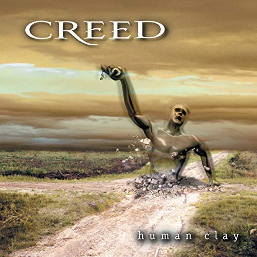
Creed – Human Clay
I’ve been over it a bit in the past – I don’t like Creed. But my dislike of the music is separate from my dislike of this terrible album cover. It looks like some random monster encounter from an old Final Fantasy game. I don’t know what this is supposed to represent and honestly I don’t want to. There’s a crossroads and some ghost-like humanoid guy popping out of it, holding a clock of some sort. The clock looks like an oven timer. It’s as if this ethereal dude is returning to the corporeal realm because his cookies are done in the oven.
I guess the horrific artwork didn’t impact Creed’s album sales – this was a massive hit and has moved over 20 million copies worldwide. Again, I won’t lie and act like I think any more of the music on the disc as opposed to the cover, but damn this is a really, really awful album cover. The worst part is that it might not be their worst one. But I’ll save that for another time.
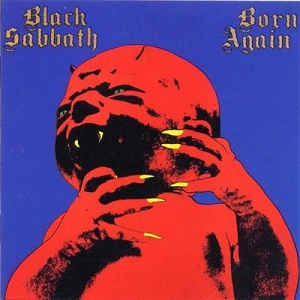
Black Sabbath – Born Again
I guess this falls in the “I tried” department. The album itself has divided opinions, I myself sit on the fence about it more than anything. But this cover is not winning any awards unless third grade art class is holding a contest next month.
I guess this is supposed to be some kind of demonic child. It almost passes for imp-like artwork, like that you’d see in a Dungeons and Dragons book. Except D&D artwork is good.
I see that at least two members of the band are with me here – both Bill Ward and Ian Gillian thought the cover was trash. Sadly, Tony Iommi didn’t think so and here we are. Also sadly, I’m going to tell a similar story with a different legendary British band in a few minutes.
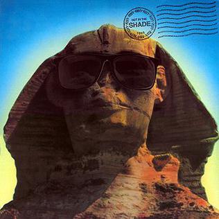
Kiss – Hot In The Shade
Kiss had a pretty rough go of it in the late 1980’s. Their albums weren’t great and they’d fallen far off their glory days pedestal. Fortunes would soon turn for them, but it wouldn’t be with this half-baked album of mostly crap.
There are a few songs worth listening to on the record. It’s far better than this cover. It seems to me like someone in the band got a hold of Powerslave and told some low-budget art director to do something like that. Kiss is a band who long plied their trade with the visual as well as the music, you’d think they’d have more sense than to release a bad picture of the Sphinx wearing sunglasses. But the band did miss on some album covers, this one being the biggest in my book.
FYI – The Sphinx isn’t in the shade so it makes no sense anyway.
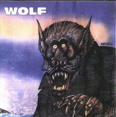
Wolf – self-titled
Wolf have been active in the metal scene for a long time now and had a period where they made some waves in the mid-00’s. This particular debut escaped my attention at the time. I probably would have noticed the cover had I seen it around.
Now, underground music is a whole other ballgame from the mainstream. These guys probably didn’t have a huge art budget. This album was released on a variety of labels like Prosthetic and No Fashion, this wasn’t an affair where some renowned artist could be paid thousands to make an awesome cover.
I’m willing to grade on a curve because the independent artist struggle is real, but damn this is an awful cover. I noticed that a reissued version of the disc a few years later featured a totally different cover. Good call.
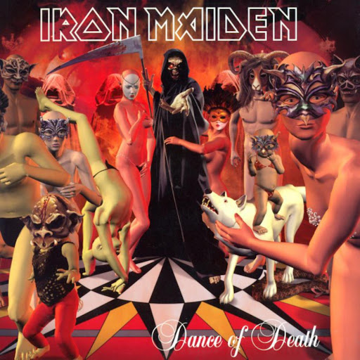
Iron Maiden – Dance Of Death
I can’t be honest about this exercise if I don’t include my favorite band. The revulsion at this album cover is easily found, it spread like wildfire the second the cover hit the Internet before the album’s release.
Maiden were known for striking cover art in their heyday. They’d left that behind a bit in their reunion era, with Brave New World having a fine yet unremarkable cover compared to 1980’s masterpieces. The reunion would soldier on to be the band’s longest era but this abortion of an album cover is one blemish on the period.
And the cover literally was an unfinished work. The artist reportedly submitted a much more pleasant version of this cover with Grim Reaper Eddie as the centerpiece, while band and/or management decided to shove a bunch of dancers in around Eddie. The artist was so displeased that he asked not be credited for the botchjob of an art piece.
Imagine something being so bad that you, as an artist, ask not to be known for designing an Iron Maiden album cover. What a world we live in.
The album itself is a solid Maiden outing, with several good songs and few bonafide epics. But the cover art is absolute drivel. Even if a few later albums could be said to have unimaginative designs, they aren’t vomit-inducing bad like this one is.
That’ll do it for this edition of bad album covers. I’ll probably do this once in awhile when I’m feeling a bit snarky. There are some truly grotesque album covers out there, and sure, they deserve a bit more attention. Happy New Year, see you in 2022.