For this week I’m pulling out one of rock music’s greatest transformation albums – a band shifting their sound to fit with the times. Some call that selling out, others call it the smart play. In the case of Heart it was very much the latter, and the group would land the biggest success of their career by fully embracing the glitz of 1980’s hair and glam rock.
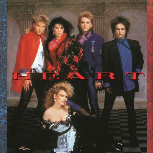
Heart – self-titled
Released June 21, 1985 via Capitol Records
My Favorite Tracks – What About Love?, If Looks Could Kill, The Wolf
Heart began in the 1970’s and released a string of renowned albums that resided in the hard rock/folk rock realm, an interesting combination not heard every day. The band gained notice with their unique blend of music and also for their front-line sisters, guitarist Nancy Wilson and lead vocalist Ann Wilson.
Then the 1980’s came and rock music changed. Heart entered the decade well enough but had two dud albums through the early ’80’s. It could be said that Heart’s musical transition was started on those albums, though the true fruits of the change would arrive with this self-titled record in 1985, just as hair metal and its associated sounds were becoming the music of the day.
The songwriting on Heart is its own tale, as some of the songs were shaped by the Wilson sisters and several others were done by outside songwriters. I won’t be running down each individual one, just a few of the more notable ones, because it would make this post 10,000 words long. Credits are available in the album’s liner notes and in many places on the Internet for those curious. The album was produced by Ron Nevison, who was one of the go-to producers of the 1980’s.
Heart boasts 10 songs in 39 minutes so not an overly stuffed album, but half of these songs were singles and a few were major hits so there’s plenty to talk about here.
If Looks Could Kill
The album opens with a cover tune of a song also done in 1985 as a dance song. Heart took a more rock approach and fashioned a pretty cool song out of it. It’s very synth heavy, which would figure since it came from the dance/disco world but it’s translated well to the melodic rock environment. The song sees a cheating lover being the object of scorn.
If Looks Could Kill was the album’s fifth and final single, and also the only one not hit the Billboard 100’s top 10.
What About Love?
Another cover song, this time from Canadian band Toronto and one that group did not release originally. Heart would up with the song and would make hay with it, hitting the top 10 of the Billboard 100.
While unfortunate that Toronto did not get to enjoy the original fruits of their labor, this song fits the Heart album like a glove. It is a defining power ballad of the ’80’s and was the keys to the car for Heart’s comeback. It is a song that reminds people who are chasing their “way to the top” that love is still out there and is a more important force than whatever comes at the end of the rat race.
Two notable guests appear to help with backing vocals – Grace Slick and Mickey Thomas from Starship.
Never
Another album single and one that would get to the 4 position on the Billboard 100. This is an upbeat, very poppy melodic rock offering about being disgruntled by love but being ready to give it another go.
These Dreams
Up next is another single and Heart’s first chart-topping hit. The song was originally written by the songwriting duo of Bernie Taupin and Martin Page, two folks who’ve had hands in countless hits. The pair offered the song to Stevie Nicks, who turned it down. Heart were more receptive to it and the rest is history.
Heart switched tack on this song as Nancy Wilson handled the vocals. Nancy had been ill during recording and the production team was quite happy with her raspy take, so much so that she’d be asked in the future to “get sick again” to emulate her style here.
These Dreams is an atmospheric track with the lyrical concept of going to a different world while sleeping and getting away from the issues of regular life. The album’s liner notes dedicate the song to Sharon Hess, a fan who was battling leukemia and met the Wilson sisters during the recording of the song. Hess died just before the album’s release.
The Wolf
Here we hit the first of a few songs that weren’t singles. This is a very nice track that’s all rock and deals with a man out on the prowl who isn’t worth the trouble he brings. This song didn’t get the attention of the hit singles obviously, but it’s well worth a listen as it’s a great ’80’s rock song.
All Eyes
Its 2 for 2 on album deep cuts here with another good rock song. It’s a nice song about hooking up, pretty standard fare for the time. So far the album’s deep cuts compliment the singles well and make for a nice album listening experience.
Nobody Home
This one is a slow ballad that also kind of throws things off for a moment. It is very keyboard driven, which is not a problem in and of itself but the key part sounds like the soundtrack bits of a Final Fantasy video game. FF didn’t exist when this song was recorded but it’s the vibe I get from the song.
The song doesn’t pick up much steam as it goes along even with other instruments coming in. It’s a nice enough sentiment about someone finding no one around when they inevitably fall, but the song doesn’t do a lot for me.
Nothin’ At All
This was the album’s fourth single and also the fourth straight to hit the Billboard 100’s hallowed top 10, hitting exactly that position. This is a very easy-going rock track about how sometimes love just happens super easy without any fuss or drama. The video for this one was pretty popular and features the band simply goofing around.
What He Don’t Know
It’s back to the rock, this one is a fairly tame number but it does pick things back up after that last song. This one puts the shoe on the other foot in contrast to the opening song, as this time a couple is cheating while the singer’s significant other is unaware. It was fairly scandalous song material for the day as adultery and cheating was a huge deal back then, but no one gives a damn today. I don’t recall this song catching any actual grief though.
Shell Shock
The album closes on one more really cool song, it’s a straight ahead rock song. Ann Wilson is going a bit rapid fire in the verses here, it’s a neat way to wrap up the record.
Heart was not only a return to commercial success for the band, this was the peak of their album success. The record topped the Billboard 200 and was on the charts for 78 weeks. It has been certified 5 times platinum in the US and 6 times in Canada. Along with four straight singles in the top 10 of the Billboard Hot 100, and this was a massive win for Heart’s ’80’s glam makeover.
Heart were successful in updating for the times and re-energizing their career, though for some it was too drastic of a move away from the classic sound that made them popular in the first place. I personally have no issue with it at all – while I think their ’70’s output is spectacular, I also love their ’80’s hair era. The songs were there and the band rode the wave of big hair and power rock/pop, usually doing it better than many others in the same era.
This would mark the start of a three-album run that saw Heart churn out more hits, including the biggest single of their run in 1987. After the “big hair” era ended, the Wilson sisters would return to their roots and explore more of the work that put them on the map in the first place. But they certainly left their mark on the 1980’s.